Seven Generations Capital
Branding
Roles: art direction, concept & design, client meetings
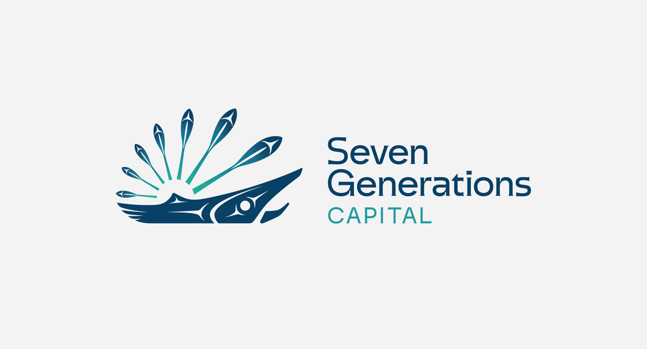
Seven Generations Capital is a new firm based in West Coast, BC specializing in private equity investments, with a distinct focus on real estate and operational businesses within Indigenous on-reserve communities.
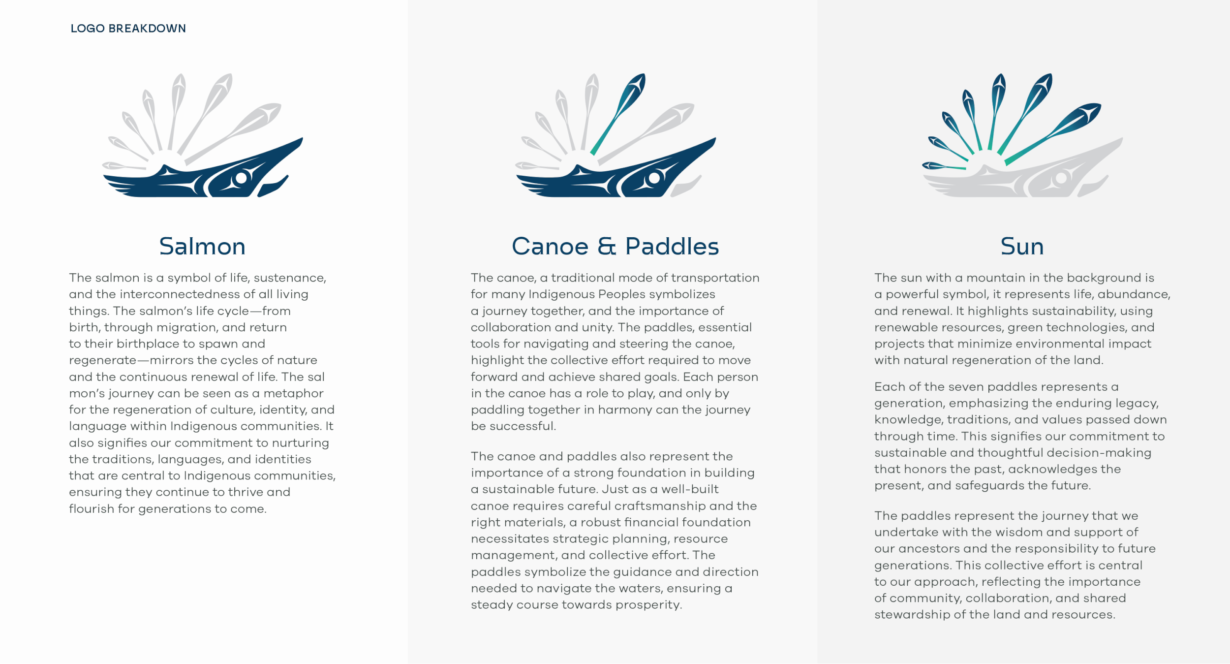
The name “Seven Generations” refers to the Seven Generations Principle, an Indigenous concept of thinking about the impact of your actions, words and work today on the seven generations after you, and remembering and respecting the seven generations who came before you, on whose shoulders you stand.
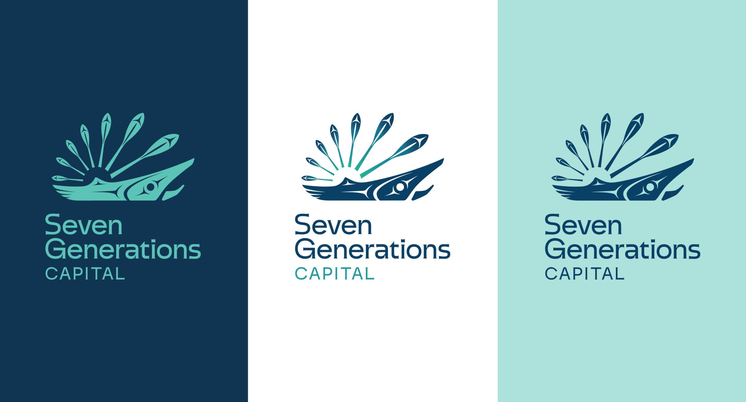
The logo is designed to be timeless, authentic and impactful. The organic illustrative style is contrasted by the modern typography with generous organic curves and nuanced water drop details, as well as flared out ends that evoke the water and wood elements featured in the unique illustration.
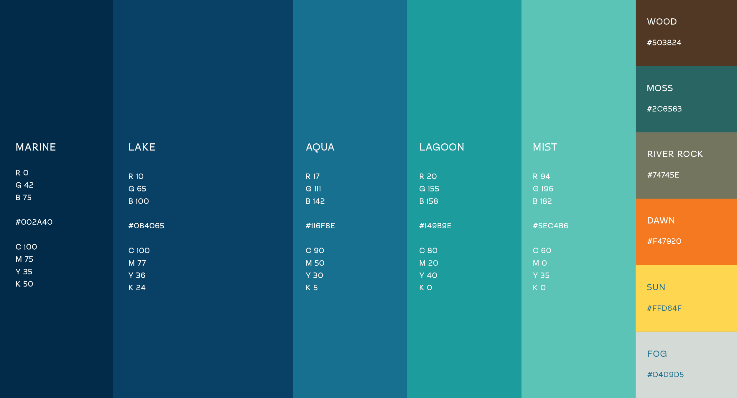
The emphasized forward motion in the logo speaks to the Seven Generations Theory of Change, defining a path moving forward. The colour palette embodies natural tones of water, inspired by the landscape, the rich history of Indigenous Peoples and their connection to nature.
The tone is empowering and trustworthy with cultural symbolism that connects to the Indigenous audience. The final result is unique and relevant for the company it represents and the communities it will serve.
Note: The logo is inspired by the Salish cultures of the West Coast and was designed in collaboration with artist James Harry, to ensure cultural authenticity.
SEVEN GENERATIONS CAPITAL/ Branding/
SEVEN GENERATIONS CAPITAL/ Branding/