Innovair Group
Brand Design
Roles: brand design, art direction, graphic design, client presentation, press checks
Innovair Group supplies and distributes air and gas for commercial and healthcare use across Canada. The company required a cohesive system that simplified and unified the sub brands under the parent brand.
The design system draws from the parent logo’s circle cluster (emanating from the “V”) to create a system that is recognizable and unique to Innovair. The sub-brand icons were developed to suit the specific role of each division. An “I” for industrial, an arrow for automation and a cross for medical. A primary colour palette was also developed to differentiate the divisions while connecting to the parent brand. The rich blue primary colour was used to unite the parent brand and sub brands, while the secondary colours were used minimally to identify and create contrast. To aid in legibility and modernize the existing Innovair logotype, a lowercase sans serif font was introduced as the identifier for the brands.
Building on the gas cluster (circles) from the brand system, a simple gradient molecule graphic pattern element was applied globally across all mediums. A comprehensive brand guide with key communication pillars was developed to reposition and reintroduce the brand. The updated brand was applied to stationery, collateral, a website, vehicle fleet, signage and tradeshow displays.
A secondary AGM “Ignite” event design was executed as a teaser to the new brand rollout. The design featured visual cues from the brand update, and consisted of a unique lanyard program guide, poster, website and branded schwag.
INNOVAIR GROUP / Brand Design /
INNOVAIR GROUP / Brand Design /


Brand Structure
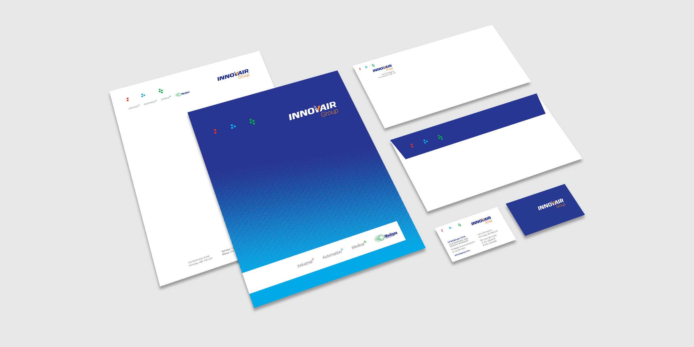
Stationery Package

Brand Guide

Website Design (Desktop & Mobile)

Trade Publication

Trade Show Displays

Vehicle Fleet Wraps

Exterior Signage

AGM Lanyard Program

AGM Poster & Website